Bitcoin Rainbow Chart Indicator: This Is How To Read It Like A PRO
Key Takeaways:
- The cryptocurrency graphing tool known as the Bitcoin Rainbow Indicator forecasts Bitcoin's long-term price valuation. The chart's colored bands are created by a logarithmic growth curve.
- Each color represents a different market sentiment which helps traders implement their strategy. Dark red means Bitcoin is overvalued, whilst dark blue means that it may be the optimal time to buy.
- Based on historical results, it usually takes a Bitcoin halving event to push the price of BTC up into high color bands.
TABLE OF CONTENTS
The price direction of Bitcoin is one of the most heavily debated topics in all of crypto. As a result, technical analysts have constantly tried to look for new ways to predict the Bitcoin price for the year ahead. One technical cryptocurrency tool that is often overlooked is the Bitcoin Rainbow Chart indicator which is often used by investors and traders to forecast future price movements. In this guide, we will detail what the Bitcoin Rainbow Chart is, explain why it was created, and outline how to read and use it to trade Bitcoin.
Featured Partner
Kraken
Best Exchange To Buy Bitcoin
4.8 out of 5.0
Kraken is a top-rated and regulated exchange best known for its safety and multiple methods to buy Bitcoin and crypto worldwide.
222
USD, GBP, EUR, CAD, CHF, JPY & AUD
Bank transfer, SWIFT, SEPA, debit and credit card
0.16% (maker) and 0.26% (taker)
The Basics of the Bitcoin Rainbow Chart
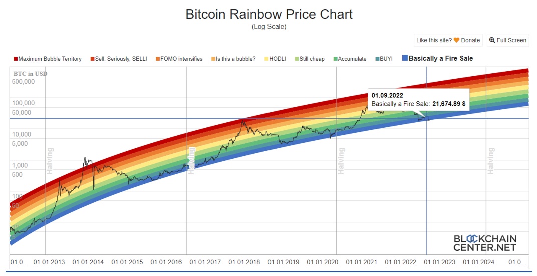
The Bitcoin Rainbow indicator is a cryptocurrency charting tool that predicts the long-term price valuation of Bitcoin. The chart is composed of colored bands generated using a logarithmic growth curve. The bands then sit on top of a logarithmic Bitcoin price chart. Each color band represents a different period of market sentiment and, therefore, shines a light on investor strategy within the market.
Colors range from dark red, which suggests that Bitcoin is reaching maximum bubble territory, to dark blue, which suggests investors should purchase Bitcoin at an extremely discounted rate. By comparing the logarithmic color bands with the current price, investors can try to forecast where the future price of Bitcoin may go.

This Is How You Need To Read The Bitcoin Rainbow Chart
Like a standard Bitcoin price chart, the X axis of the Bitcoin Rainbow Chart represents time, while the Y axis represents the price. Due to Bitcoin’s exponential growth over the years, the Y axis is represented logarithmically.
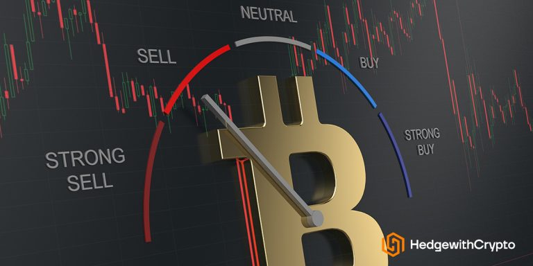
The 9 different logarithmic color bands sit on top of the Bitcoin price chart and highlight market sentiment associated with particular Bitcoin price levels. Investors can use the position of these color bands to help determine whether it is a good time to buy or sell Bitcoin.
The meaning of the different color bands are as follows:
- Dark Red. Maximum bubble territory – Bitcoin is extremely overvalued. Purchasing Bitcoin at this time is not recommended.
- Red. Sell. Seriously, SELL – Bitcoin is overvalued and investors should consider selling. Purchasing Bitcoin at this time is not recommended.
- Dark Orange. FOMO intensifies – The fear of missing out is gripping the markets and the price of Bitcoin is becoming overvalued. Purchasing Bitcoin at this time is not recommended.
- Orange. Is this a bubble? – Momentum in the market is starting to build. Investors should research if a bubble is forming or not.
- Yellow. HODL – Bitcoin is in neutral territory. Investors should Hold On For Dear Life (HODL).
- Light Green. Still cheap – Bitcoin is moving into a fair valuation with some potential room for growth.
- Green. Accumulate – Bitcoin is moving into an undervalued territory and is gaining more potential room for growth.
- Light Blue. BUY! – Bitcoin is now at a good price to buy with plenty of room for potential growth.
- Dark Blue. Basically a fire sale! – The price of Bitcoin has dropped so much that it can now be purchased at an extreme discount. This could be an optimum time to buy Bitcoin.
The Bitcoin Rainbow Chart Is Accurate
While useful, the rainbow chart can only approximate where the Bitcoin price may head in the future and will not provide 100% accuracy. Other than the logarithmic regression, the color bands on the Bitcoin Rainbow Chart are not based on any scientific method. It is, therefore, important to remember that the Bitcoin Rainbow Chart is unlikely to be correct forever. While Bitcoin price has continued to accurately follow the logarithmic color bands so far, there is no certainty that price will continue to remain constrained in the future.
Instead, the Bitcoin Rainbow Chart aims to highlight Bitcoin's long-term price movement. As the chart is designed for long-term price movements, it is more useful to long-term investors. Other than Bitcoin's long-term price movement, the chart does not take into account any other technical factors such as crypto volume, trading volatility, or momentum. Therefore, it is not a tool recommended for day trading. Even for long-term investors, the tool is best used in conjunction with a range of other technical analysis methods.
Bitcoin Rainbow Chart Prediction
Since 2012, we can see that the price of Bitcoin has primarily stayed within the bounds of the Bitcoin Rainbow Chart. There are only a couple of brief moments where the price has extended outside of the color bands, such as at the top of the bull cycle in December 2013. But shortly after, the price reentered the logarithmic channels.
As of June 2022, the price of Bitcoin has moved into the dark blue section of the chart; otherwise known as “fire sale” territory. According to the logarithmic color bands, this equates to a time when Bitcoin is severely undervalued. Each time the Bitcoin price has dipped into this color band, it has corresponded with the bottom of a bear market.
However, remembering that the Bitcoin Rainbow Chart is only correct up until the point that it is not, we will now need to wait to see if the price of Bitcoin drops below this final dark blue band. Equally, if it stays within the dark blue band, there is no way of knowing how long it will stay there.
When looking at previous cycles we can see that it takes a Bitcoin halving event to push the price of Bitcoin up and into the higher color bands. However, the next halving event is not expected until mid-2024.
Bitcoin Rainbow Chart vs Stock-to-Flow Model
Like the Bitcoin Rainbow Chart, the Stock-to-Flow (S2F) Model is another popular tool for helping investors predict Bitcoin's future price movements. The model was first popularised by a pseudonymous Twitter user known as PlanB and became a popular reference graphic for Bitcoin investors.
According to the model, the price of Bitcoin is directly correlated to the scarcity of the asset. A shortage in Bitcoin results in a decrease in supply which leads to an increase in price. The number of bitcoins left in circulation defines the stock and the number of bitcoins mined in a single year defines the flow. As the flow of Bitcoin is preprogrammed and can, therefore, be predicted, the future price of Bitcoin can be forecast.
Like the Bitcoin Rainbow Chart, the S2F model can only estimate the future movements of the Bitcoin price. Recently, the S2F modeled price of Bitcoin has begun to deviate from the actual market price.
Frequently Asked Questions
When Was The Bitcoin Rainbow Chart Created?
The Bitcoin Rainbow Chart was first constructed by a Reddit user, known as Azop. In 2014, Azop created the chart as a fun way to help evaluate the long-term price movements of Bitcoin. The chart was created using rainbow colors, which is where the name of the chart was derived. After popularity grew, news of the chart reached a developer known as Trolololo who worked for a website called Bitcointalk. Trolololo applied a Logarithmic Regression to the colored bands, which is a function that allowed the bands to increase in a non-linear way.
Is there an Ethereum Rainbow Chart?
Yes, the principles of the Rainbow Chart have been used to create an Ethereum Rainbow Chart. After several requests from the community, Uber Holger tweaked the formula for the Bitcoin Rainbow Chart so that it fits with Ethereum's price. Just like Bitcoin, the chart can help investors to determine the optimum times to buy and sell ETH.
You might also be interested in
Updated Dec 19th, 2025
Crypto Fear & Greed Index: This Is How To Use It

Updated Dec 19th, 2025
Bitcoin Dominance Chart: How To Read It When Trading Altcoins

Updated Dec 19th, 2025
This Is What Will Happen To Bitcoin In A Recession (It’s Not Recession Proof)

Updated Dec 19th, 2025
9 Best Crypto Chart Websites & Software
James Hendy
James has been involved in the cryptocurrency markets since 2018. He is a sought-after crypto writer that has published works for many cryptocurrency exchanges, fintech platforms, financial publications and investment disruptors worldwide. James work has been featured on the comparison website Finder and Real Vision covering topics in finance, business and the global economy.